When it comes to famous logos from big-name brands, it takes a lot of work to get their logo right. Over the years, companies pay millions of dollars to other companies to continuously create new, exciting, and memorable pictures to associate with their brands. While we know most of them at first glance, we don’t always remember every tiny little detail. Signs.com, a custom signage firm, decided to create an experiment to see how many people truly remember all the details from famous logos. Sure, we may be able to point them out at first glance, but can we recreate the exact logo from memory? You’d think that it’s easy, but, when Signs.com asked 156 Americans between the ages of 20 and 70 to draw 10 pretty famous logos, the results weren’t what you’d expect them to be.
While many people couldn’t pinpoint the exact logo in its specific shape, font, and exact size–they were able to get the colors down exactly. Companies do psychological studies to use colors to correlate with emotional reactions and appeal. According to Karen Haller, a leading authority on color psychology:
“People have an emotional connection with color first. Then we take in the shapes, the logo, and we read the words. If we sense a mismatch, it’s the color we don’t believe, despite the beautifully crafted words.”
It’s pretty spot-on to think that the majority of people would remember the colors of each company first–as we’re always looking at millions of ads, the most popular ones are branded into our minds. But, while color may be easy to remember, it’s clear the rest of the details are a bit lost in translation and memory–as you can see by these hilarious (and some way too awful) fails. Big ups to Signs.com for providing us with this awesome experiment.
1. Apple:

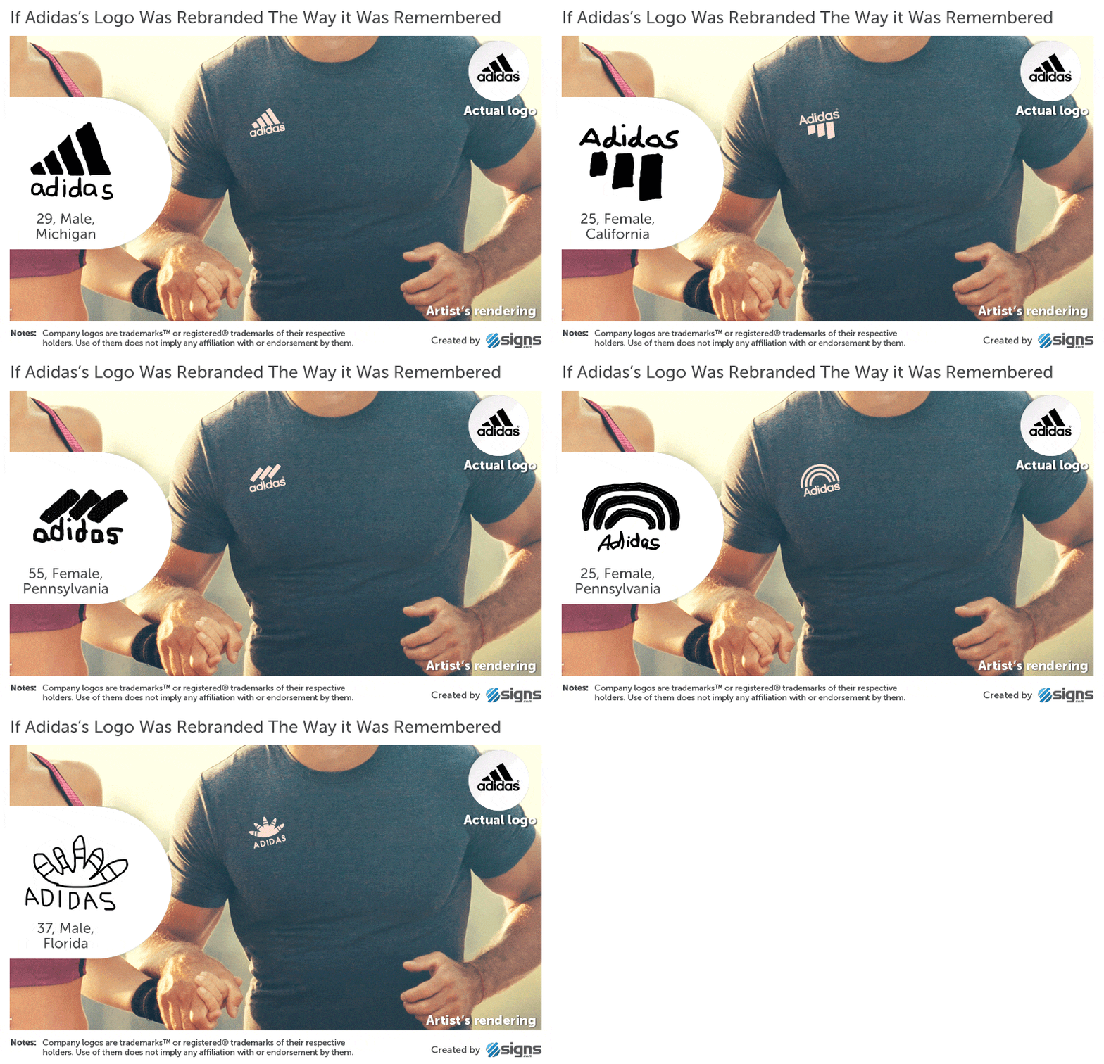
2. Adidas:


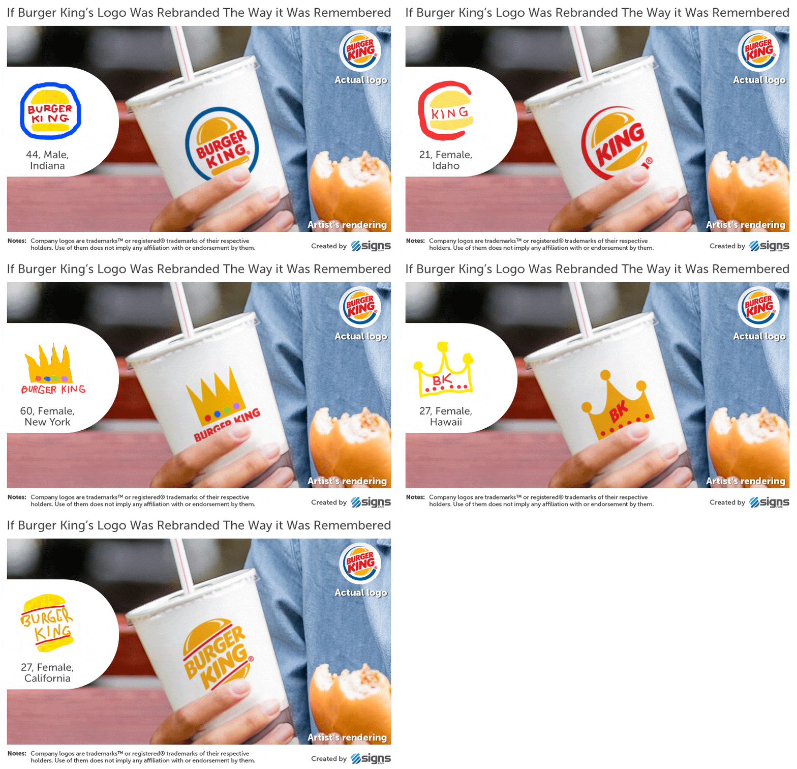
3. Burger King:


4. IKEA:


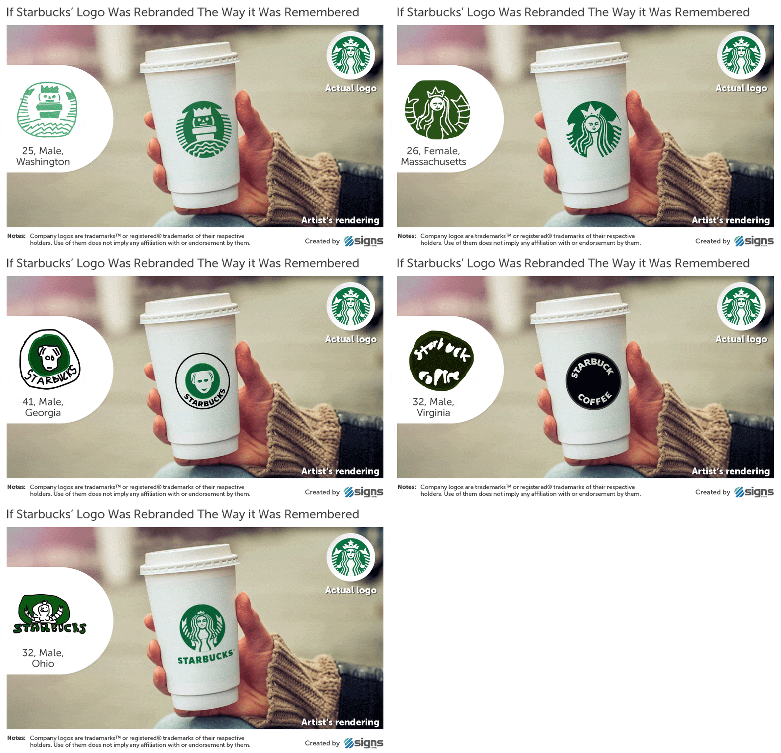
5. Starbucks:


